
When I started designing I used Dribbble for inspiration. For those unfamiliar with Dribbble, it’s a self–promotion and networking platform for digital designers, often serving as an online portfolio to showcase design ideas. Basically, you can share designs you’ve made and give feedback to other users.
Dribbble’s great, but there’s a problem with it: many contributors are missing the purpose of design. Lots of people have written about this, and it’s not the purpose of this article to rant about Dribbble. The TL;DR of the matter is that Dribbble is full of nice artwork that’s often disconnected from real contexts of use.
Go onto Dribbble and do a quick search for weather widgets and you’ll find stuff like this:
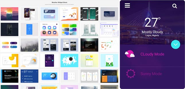
Dribbble (screenshot). Weather widget designs on Dribbble [digital image]. Retrieved from Dribbble.
The design on the right is aesthetically pleasing but functionally deficient. A few questions right off the bat:
The way an interface looks and feels definitely matters in the overall experience. But the point is, design is not artwork; design is design.
The word design entered the English language in the 1580s, borrowed from Middle French desseign meaning “a scheme or plan in the mind” or “an intention to act in some particular way” (according to
Online Etymology Dictionary). Today, the Cambridge Dictionary defines design as “the way in which something is planned and made”.
Design has never meant ‘shiny output’. It’s a plan to solve a problem, and the process you follow to get there. This gets to the heart of UX.
If design is about solving problems for people, then you have to take an approach that puts people at the centre.
The user–centred design process has many expressions. At Fathom, we like to use the Double Diamond framework created by Design Council. The first diamond represents ‘divergent thinking’ (exploring an issue widely) and the second represents ‘convergent thinking’ (taking focused action).
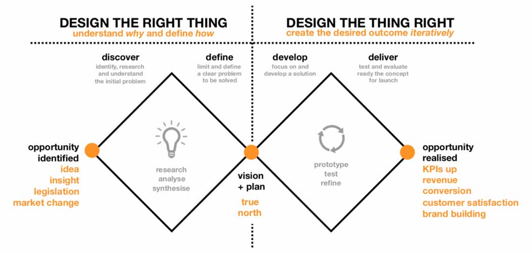
Fathom (image owner). Double Diamond framework by Design Council [digital image] / modified by Fathom
I’ll use a very unsophisticated example to demonstrate how the Double Diamond works. Going back to our weather widget, imagine you’re a designer at a software company. You know through observation and experience that people can’t predict the weather without accurate data and interpretation (aside from knowing that, here in Northern Ireland, it will rain tomorrow).
So if ‘helping people predict the weather‘ is a market opportunity, what should your design process look like?
Start by asking questions, rather than brainstorming answers. The focus here is identifying who will be using your design and in what contexts. For example:
Methods you could use in discovery include (but aren’t limited to):
In discovery you’ll get lots of insight into people’s problems and experiences. But that doesn’t necessarily define the challenge you’re trying to solve.
Let’s say hypothetically an even 50% of participants complain about the local council’s response times to clearing fallen trees off the roads, and the other 50% complain that the buses are always running late when it snows.
Here are three ways you could define the problem:
a) The council needs more resources to respond to emergencies
b) The department for infrastructure needs to build more bus lanes
c) People need the ability to plan their journeys and avoid disruptions
Raising taxes and changing how the government spends our money is a big ask and undoubtedly polarising (especially if you’re asking for more bus lanes). But addressing the underlying need in option C is both feasible and universally beneficial.
The previous steps were about designing the right thing. Now we’re into designing the thing right.
Based on your research, you want to think of ways you can help people predict the weather and use that information to plan their journeys better. For the sake of consistency, we’ll assume the research is conveniently pointing towards using a mobile weather widget (though in practice, an open mind is essential – the solution might not even be digital).
The solutions are in your customer interviews and user tests; AKA your evidence. For example:
Evidence: 8/10 users have multiple transport options for their commute
Potential solution: Links to bus and rail companies’ timetable pages
Evidence: 9/10 users are happy to take shortcuts to shave a few minutes off a journey
Potential solution: Pull in Google Maps live traffic data
Evidence: 6/10 users forget to check the weather on a regular basis
Potential solution: Allow users to set up notifications for disruptive weather conditions
Never take evidence in isolation from other factors. If the transport companies don’t have HTML timetables on their site, the solution may be to integrate with a PDF viewer.
You’ll find that some solutions are a clear win for most users, while others are only important to some users. This is where a skilled designer makes their living by prioritising the most widely used features, but not at the expense of easily accessible advanced features. It’s a fine balancing act that can be solved in the final stage.
An early design is only ever a hypothesis. Before your boss signs it off, your users have to sign it off.
Start with a low–fidelity (lo–fi) prototype and get it into the hands of representative users. Lo–fi can mean many things. Generally, we’re dealing with paper sketches, screenshots, maybe basic greyscale wireframes with a few clickable elements. We’re definitely not getting into detailed interactions and brand guidelines at this stage.
Set realistic tasks for your users and record their behaviour, attitudes and performance. Things you might look for in your weather widget are:
Be objective and don’t get too attached to your prototype; good experience design is always iterative. Be prepared to go back as many pages on the drawing board as it takes to get your design right.
User–centred processes like the one described above may completely take the fun out of design for some Dribbble users, but it’s extremely rewarding. I enjoy getting compliments on my pantones as much as the next designer, but observing real users having a better end–to–end experience with something I designed is far more satisfying. It also puts a smile on clients’ faces; solving people’s problems through improved user experience typically results in higher conversion rates, fewer support tickets, increased brand loyalty and lower operating costs.
If you use Dribbble and you’re serious about user experience, why not give the Double Diamond a go for your next interface design? Remember to include some notes about how you defined and developed your solution – you never know who you might inspire.
Cover image: Vissers, B. (photographer). Dribbling basketball [digital image]. Retrieved from Burst / modified from original.
Pujith is in his second year studying BDes (Hons) Interaction design at Ulster University and he is our 2019–2020 placement UX Designer.