

- By Andy Robinson (Fathom)
If you’re involved in any aspect of selling things online, you probably know a thing or two about metrics. Perhaps one of the most talked–about metrics in your place of work is the elusive conversion rate, or in plain English: are people buying your stuff?
Designing or managing an e–commerce project can be daunting, but it doesn’t have to be overwhelming. There are loads of UX articles and resources kicking about the web to help you make informed decisions, with excellent research to back you up in meetings.
These articles are great because they keep you right when it comes to general design principles, but they only solve one part of the puzzle. Your company – or your client’s company – is unique, and has its own distinct set of users. This means there are always certain nuances that you can only discover through direct contact with them in the form of user research.
I’d like to suggest some ways to help you ensure that your e–commerce design works for humans, and meets the needs of your particular users. Continue reading to discover four components you need to build into your site to convert visitors into customers.
If you’re looking at the site design purely from a sales and marketing perspective, you can get caught in the trap of thinking all your users are on a single–track mission to the checkout. But one of the primary indicators of success in e–commerce design is when lots of different users can come to the same website, for lots of different reasons, and they all leave satisfied that they’ve completed their task(s).
When Fathom worked with a local theatre to review the usability of their website, we began by speaking to staff working in the booking office to identify the range of user tasks across the booking process. We then set a number of scenarios for test participants to engage with. One of the more complex tasks was to book tickets for a family of five to go to the pantomime, at a specific time on a particular day, and choose their preferred seats – picking up a bottle of champagne on the way to the checkout. Most participants completed this quite easily, which may sound like the site was working well.
However, we then asked them to do something simpler. They had to assume the role of a tourist visiting the capital on a city break and look for general information and ideas for things to do. At the end, most participants were not confident that they had got what they came for. The site had been designed to encourage conversions, but, primarily, only one type of scenario was being catered to: users who arrive, find exactly what they want, and buy it.
Users come to your site with different goals, and they also have different tasks in mind at different stages of the e–commerce flow. Your site may need to allow them to do hundreds of different actions, but if one user can’t complete the three or four goals they need to do in a single visit, they probably won’t convert. And if you don’t consult your users, how can you understand what those tasks are?
When users arrive at your site to get stuff done, it’s important that the content they need is easy to find and is placed where they would expect it to be.
You’ll be hard pressed to find a big high street retailer that doesn’t have a mega menu on their e–commerce site. Mega menus have been popular for at least a decade, and perform well from a usability perspective as long as grouping, timing, ordering and accessibility are duly considered.
As users ourselves, we rarely notice websites that have done this well. But that’s the whole point – we shouldn’t need to think about it. We simply need to get to the area of the site that has what we want.
In the example below, Marks and Spencer uses a very minimalist design on desktop that helps the user focus on the task of finding things. My only complaint here would be that the subheadings – while bold – do not stand out well against the other text. But otherwise, the structure and layout makes sense and doesn’t look crowded.
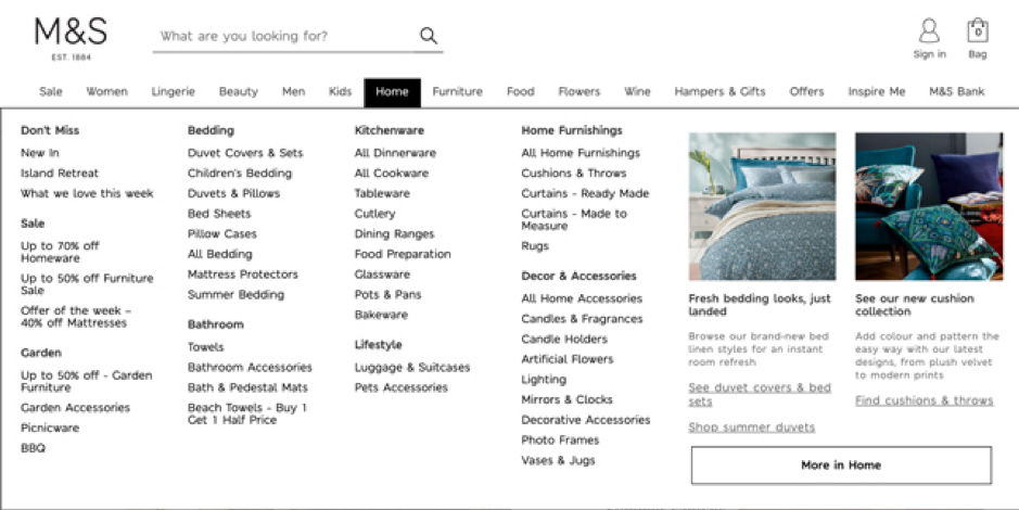
Robinson, A. (image owner). Dropdown mega menu [screenshot]. Retrieved from the Marks and Spencer website.
But it’s Marks and Spencer’s mobile mega menu that’s particularly well designed. Some of the highlights are
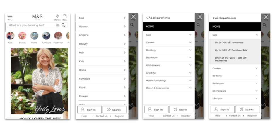
Robinson, A. (image owner). Marks and Spencer mobile menu [screenshots]. Retrieved from the Marks and Spencer website.
Even when you have your users’ goals figured out and have made it easy for them to find what they’re looking for, they can still drop off the conversion path if it looks like too much hassle to complete a purchase. Let’s talk about two design principles that can help to motivate users to complete tasks.
Progressive disclosure
Progressive disclosure is a design technique used to help maintain the focus of a user’s attention by reducing clutter, confusion, and cognitive workload. In other words, you should enable users to do common tasks quickly and easily, but if some users want more information or advanced features, they can access them straightforwardly.
In e–commerce, this might mean showing users just enough details on a product comparison page to decide what they want and move on to the checkout, while allowing other users who are less decided to click through and see all the product information available.
For example, Myprotein has a ‘Quick buy’ button that lets the user quickly select their desired flavour, amount and quantity, and add it to their basket in a simple pop–up. Alternatively, there’s a ‘View more information’ button for users who aren’t ready to buy yet.
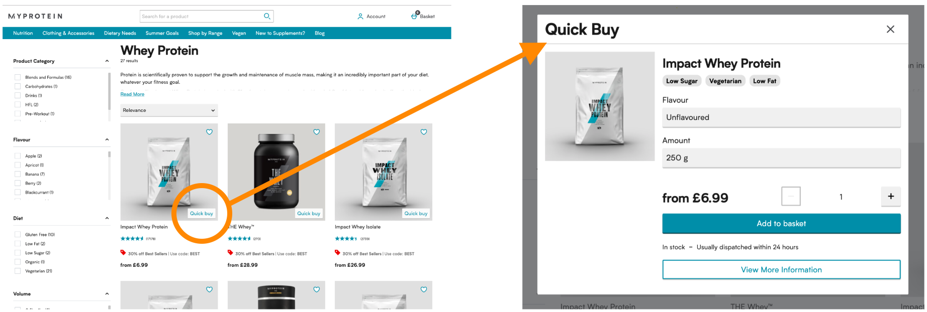
Robinson, A. (image owner). MyProtein ‘Quick buy’ feature [screenshots]. Retrieved from the MyProtein website.
Progressive disclosure should not be confused with staged disclosure, where a linear set of tasks is split up into manageable chunks. Think sign–up forms and checkouts.
Booking.com does staged disclosure really well when users are creating an account. The forms are very neat, the calls to action are clear, and the progress indicators tell the user exactly what to expect, while giving them the option to skip. This gives the user plenty of control and a sense that the process shouldn’t take too long.
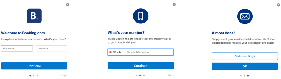
Robinson, A. (image owner). Booking.com account set–up process [screenshots]. Retrieved from the Booking.com website.
Social proof and trust signals
Social proof makes the user think “other people are doing this, it must be worth doing.”
Trust signals make the user think “other people are doing this, it must be safe.”
Your e–commerce site needs both to get the best conversion results. Have a look at Firefly‘s website.
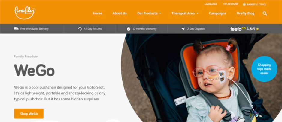
Robinson, A. (image owner). User–centred design on Firefly [screenshot]. Retrieved from the Firefly website.
Firefly is a globally recognised pioneer in the research, design and development of clinically focussed, posturally supportive products for children with special needs. When Fathom worked with them to improve online conversion rates, we spoke to their users and found that trust and reputation are critical brand drivers for Firefly. We dug into what concerns customers were having when they arrived at the homepage, and placed helpful information right at the top of the page to answer customers’ questions before they get to the checkout. This includes Firefly’s high customer rating from review accumulator Feefo.
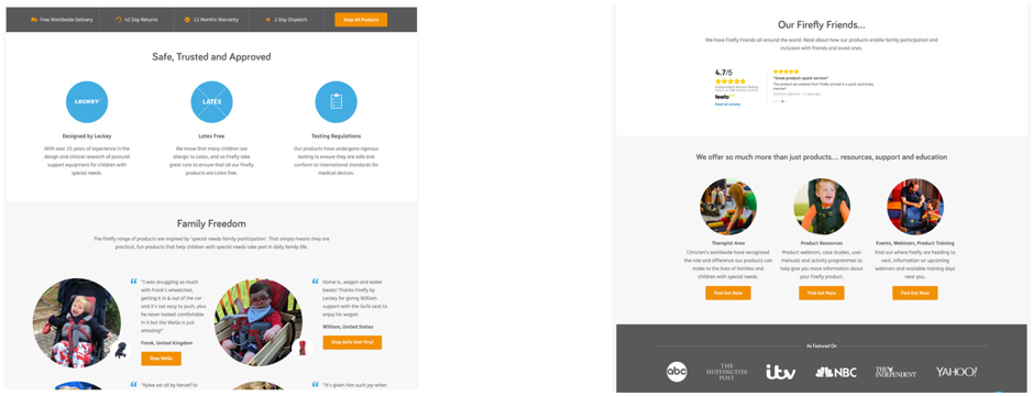
Robinson, A. (image owner). Firefly website design [screenshots]. Retrieved from the Firefly website.
The quantitative Feefo score, which is visible throughout the site, is complemented by positive qualitative feedback from real customers, who have also shared heart–warming images that other parents and carers can connect with. Trust signals are provided in the form of clear copy and icons, with reassuring statements like ‘latex free’, ‘35 years of experience’ and ‘international standards.’ The big media brands at the bottom of the home page also help to legitimise the brand.
You can read more about how to use social proof in our recent article about microcopy >>
When people speak of “usability” they are most often referring to this phase of conversion planning. This refers to the importance of providing the user with control, confidence and ‘scent’. The very best websites give users a really clear understanding of the suite of tasks available on arrival, and quickly focus on the task in question once the user begins it. This is really important in online checkouts.
Fathom worked with Vita Liberata to optimise their mobile conversion rates. We conducted an analytics review, a comparative analysis and a heuristic review to get a rich understanding of user journeys and identify blockers to conversion. We observed that
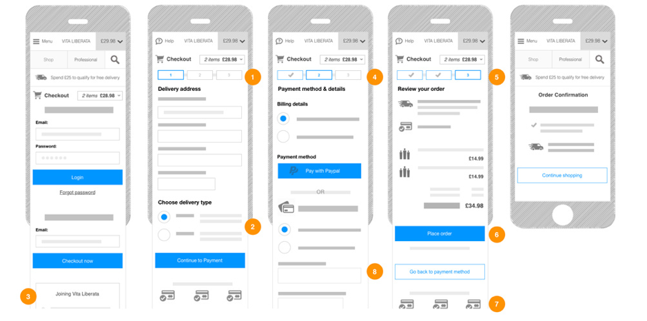
Fathom (image owner). Vita Liberata mobile wireframe design [digital image]. Property of Fathom.
We used annotated wireframes to indicate how we could make improvements, such as
If you’re involved in designing or managing an e–commerce site, I’d encourage you to learn more about UX design principles for key elements like navigation, sign–up forms and checkouts – Baymard Institute is a great place to start. But don’t stop there.
At Fathom, we recognise that you need to ‘design the thing right’ through the use of best–practise checklists, however, we rely on user research to give us the insight needed to ‘design the right thing’.
This article contributed by Fathom was originally published on the Fathom blog.
